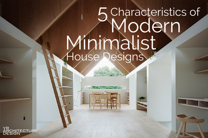
Minimalism has become quite popular over the years as a design philosophy and way of life.
Minimalist architecture is about achieving better design through simplicity – a simplicity of form, space, materiality, detail, and color. Minimalist design also shows restraint and a careful paring down and editing of spaces to get to a place of clarity.
We appreciate modern minimalist design at YR Architecture + Design. Who doesn’t like clean, open spaces that allow the architecture, the furniture, and the materials in the room to breathe? It’s the simple, honest detailing and simple materials that make minimalism so appealing and why we enjoy creating minimalist spaces – because we appreciate the calmness, the warmth, and the beauty that these kinds of spaces exude.
Characteristics of modern minimalist house design include:
- Simplicity in form and function
- Uncomplicated cladding & wall finishes
- Clean, open, light-filled spaces
- Simple detailing devoid of decoration
- Strategic use of materials for visual interest, texture, and personality
Below are some inspiring projects we like of modern, minimalist houses that beautifully illustrate the “less is more” mentality of minimalist architecture.
1. Simplicity in Form and Function
Many minimalist houses have a simple, straightforward, efficient plan layout with stacked volumes of spaces. This creates clarity in the plan, where spaces are predictable and uncomplicated. Simple forms, open floor plans, minimal interior walls, modest storage areas, and an emphasis on views and daylight are defining characteristics of many minimalist floor plans.
Uncomplicated punched openings for doors and windows punctuate the facades. Overall, there is a simple house design that avoids a lot of ins and outs, complex curves, or angles. Simple roof profiles are also characteristic of minimalist homes.
 [The Stripe House by GAAGA.]
 [The Stripe House by GAAGA. Photo by Marcel van der Burg.]
 [The Stripe House by GAAGA.]
 [The Stripe House by GAAGA. Photo by Marcel van der Burg.]
2. Uncomplicated Cladding & Wall Finishes
Using a simple continuous exterior cladding material can easily provide visual appeal and articulation by expressing the physical characteristics of the materials and their texture.
In the photo on the left below, the 2×2 horizontal cedar slats provide relief and interest to the facade. The siding on the right creates eye-catching appeal in its lap joints and blue color that pops against the otherwise white interior in the photo on the right. Also, note the lack of splice joints in both photos. Each horizontal course is one continuous piece, another nice feature.
 [House in Ujina by MAKER. Photo by Noriyuki Yano.]
 [House in Ujina by MAKER. Photo by Noriyuki Yano.]
 [The Four Cornered Villa by Avanto Architects. Photo by Kuvio.]
3. Clean, Open, Light-Filled Spaces
 [The Stripe House by GAAGA. Photo by Marcel van der Burg.]
 [The Stripe House by GAAGA. Photo by Marcel van der Burg.]
4. Simple Detailing Devoid of Decoration
 [Y House by Tamizo Architects.]
 [Private residence in Vega, Norway by Kolman Boye. Photo by Lindman Photography.]
5. Strategic Use of Materials for Visual Interest, Texture, + Personality
In the project below, the material palette is limited to mostly concrete and glass. Yet, the board-formed concrete provides texture and interest to the minimalist interior design.
 [JD House by BAK Architects. Photo by Gustavo Sosa Pinilla]
In the project below on the left, the texture and grain of the tile pattern adds visual interest to the simple neutral palette of the modern bathroom.
Eye-catching materials such as the brick wall on the right below can stand on their own without the need for shelving and knick-knacks to clutter them up.
 [Paling Fence House by NASA – National Architecture Space Administration. Photo by Nil Koenning.]
 [Interior DI by INT2 Architecture.]
 [Paling Fence House by NASA – National Architecture Space Administration. Photo by Nil Koenning.]
 [Interior DI by INT2 Architecture.]
The projects above show that good minimalist house design can be achieved through simplicity in forms, materials, and details. It isn’t about sensory deprivation, purging all your possessions, or ruthlessly cleaning house; it has more to do with choosing order, clarity, calmness, and intention. By focusing on a handful of elements we are not living with less, but rather drawing attention to the shape, color, and texture of the things and spaces we inhabit.
So let’s recap:
[Featured image: Koya No Sumika by mA-style Architects. Photo by Kai Nakamura.


 [T Space by
  [Long Crendon by


Thanks. Re article minimalism.