This project spotlight introduces a new contemporary lakeside house on Rhodhiss Lake, NC. Find out more about this project on our project page.
In this post, we pull back the curtain on our conceptual design process for our Rhodhiss Retreat in the highlands of North Carolina. Follow along as we craft a custom home design concept for this lakeside property.
Project
The project is a new contemporary lakeside home in North Carolina. Our client’s vision is a lakehouse that connects with the landscape, caters to their active lifestyle, and has many opportunities to engage with the outdoors. It should also accommodate frequent visits from family and friends with dedicated space for loved ones to retreat to.
As is the case with many people building a new custom home for the first time, our clients weren’t sure about the specific space requirements for the home. They had an idea of the rooms they wanted but didn’t know exactly how many square feet it would need to be.
Project Requirements
Based on our client questionnaire and subsequent meetings, we honed in on a size of approximately 3000-3500sf for the home. Our clients wanted three bedrooms and baths, an exercise area, great room, screened porch, and ample outdoor spaces to enjoy the outdoors.
But, designing lakeside homes is about more than just designing what’s inside the home. It’s about designing the experience of living on the lake. Some people may even say that the exterior spaces are more important than the house itself!
So aside from the house, there’s the outdoor patio to grill from and share drinks on. There’s the screened porch to enjoy the outdoors when it’s raining or during the buggy season. And there are landscape features (plantings, gardens, walking paths, fire pits) that help connect the home to the site.
There are also site improvements like the driveway, parking area, buried propane tank, boat dock, and potential phase II guesthouse. Each of these site components takes up space and affects the design of the home and its placement on the site so we need to know about them now.
For example, for a traditional gravity-fed septic system, the septic field needs to be downhill of the house so we need to designate that space and keep the house at a higher elevation.
The Site
Our site is a two-acre pie-shaped lot with 500 linear feet of shoreline.
 Google Maps
 Project Site
The property is located in a newly established waterfront community that is largely undeveloped. There will be neighbors on the adjacent lots but when, where, or what the homes will look like is unknown. What’s important to note here is that we’ll need to address privacy from both sides of the lot.
 Project Site
 Aerial view of site
The land around the lake is underdeveloped, at least compared to its neighbors Lake James, Lake Norman, and Lake Hickory. This is an opportunity but also has some risks. There’s a big opportunity to be one of the first nice custom homes built on Lake Rhodhiss to set a precedent for future development. There’s also a little of a risk because it’s unclear how the rest of the lots around the lake will be developed or their size, design caliber, or level of finish.
In essence, we don’t want to over-build for the area, but we also don’t want to miss out on the opportunity to create something special and set a high bar for future development.
Site Analysis
The site plays a critical part in the design of a lakeside home. It’s the relationship to the water and the landscape that root the home in its place and connect it with the land.
On this site, the topography gradually slopes up from the water’s edge at approximately 10% grade. At this gradual incline, a walk-out basement approach is probably not the best strategy unless the owners are prepared to do a lot of site work to recess the home farther back into the earth or build up the grade to achieve this elevation drop.
A ranch-style home that unfolds onto the landscape seems like a better strategy. This is also aligned with our client’s desire for the main spaces of the home on the ground level.

Site Section
A flood plain crosses the site approximately 75 ft from the shore so we want to stay above that elevation. As far as trees go, the site is mostly peppered with tall pine trees. There is, however, a larger concentration of pine and oak trees along the shoreline that the community would like to preserve to ensure a green backdrop along the water’s edge from the water. A tree survey provided the exact locations of the trees, their sizes, and the species.
Our goal for this project is to preserve as many trees as possible to give the home an immersive feeling on the land.

Tree Survey
Site Planning
After understanding all that we could about the clients, the project requirements, the site, and the setbacks, we started site planning. We thought about how the house would be situated on the lot and how the other site components would relate to it.
One of the first things we located was the approximate location of the septic field. Ideally, the system is gravity-fed (more cost-effective) which means that it needs to be located downhill of the house. Without a perc test, it’s unclear how big the field needs to be or its exact placement. We’re proposing a location and approximate size on the site for now until we get the results of the testing and engineering which is a few months out (the County is behind on scheduling site evaluations).
To help us figure out where to locate the house, we needed to consider the existing dense tree line, the setback from the water, the floodplain, septic field elevation, and the approximate location of neighboring structures. We also needed to be mindful of the shade that the dense tree line creates since our lot is south-facing.
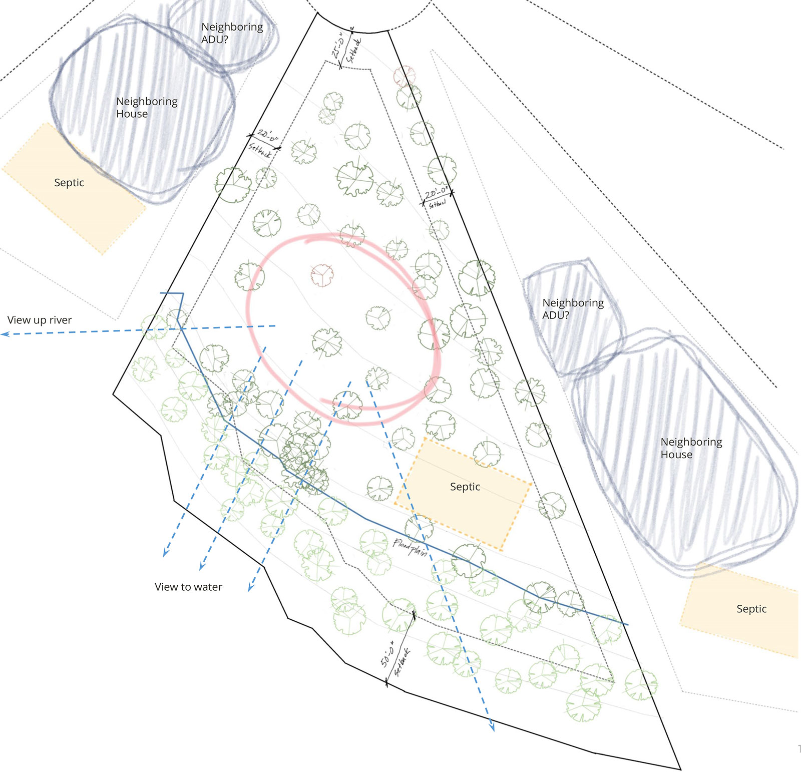
Site Planning Diagram
Programmatic Massing / Space schematics
Working in tandem with the site planning exercise, we also started to study the massing and programmatic layout of the home.
Based on our early investigations of the topography, we determined that a ranch-style, mostly one-story scheme, would be the best approach. We also confirmed the size of the ground floor (the footprint) based on the spaces that wanted to be on the ground floor.
To further organize the spaces we categorized them based on 1) the importance of views/access to the water and outdoors and 2) public/private/service classifications.
Views/Access to the Water and Outdoors
Since we’re on the lake, we wanted important spaces to have primary views of the water and/or access to the outdoors. Knowing which spaces need that relationship helps us to roughly determine how “long” the home should be, or how much frontage it should have facing the water.
Still, we have to be realistic because ALL the spaces can’t face the water. We didn’t want a super long narrow home, nor would the site allow for that. So, we prioritizes the important spaces that NEEDED a connection to the lake, and then determine a strategy to give the other spaces a secondary connection like borrowing views.

Public/private/service spaces
We’ve talked many times in past blogs about grouping spaces by public, private, and service functions is often a good starting point to organizing spaces. One strategy is to group all the public spaces near each other and all the private spaces near each other, with service spaces (like a mudroom, powder room, garage, and pantry) near public spaces.
Using these two grouping strategies, we studied various relationships and massings of space as they related to the site. After some preliminary scribbles on tracing paper attempting to organize the spaces into some larger boxes, we came up with two good ideas for the massing.
We knew we wanted large generous outdoor spaces off of an open great room flowing out from the house to the lake. We also knew that views from the principal suite were of the utmost importance. This helped establish our main “frontage” criteria for the lake.

Massing Studies
Relationship to the topography
While reviewing various layouts on the site, we also needed to think three-dimensionally to address the site’s topography.
As the site slowly falls toward the water, how does this affect our massing studies? How do the various entries, outdoor spaces, and screened porches relate to the surrounding terrain? Do we need to step up or down inside the house to create a better relationship with the land? Do we need to have retaining walls or carve out the earth anywhere?
All good questions. And all things that needed to stay top of mind as we dive into conceptualizing the home.
One important thing to remember about the impact of the topography was that as the home grows in depth (perpendicular to the contours) the more the grading would affect the design (since it gradually slopes uphill). With a garage farther away from the main entrance and great room, we have to be mindful of the driveway elevations at the garage. Would we need to lift the garage wing to work better with the grade and have an interior step down to the main level? Would we want retaining walls along the driveway instead? This is something we’ll continue to revisit throughout the design phase.
Nevertheless, we wanted the end result to be a home that feels rooted into the ground along the street-facing side while also feeling “lighter” on the earth on the lakeside. This also plays into our idea to have a more transparent lakeside elevation with a lot of windows.
Design Phase
All the work leading up to this point has prepared us for the exciting Design Phase. We took our two massing schemes and turned them into conceptual designs. The massing schemes helped us come up with the big design moves of the house, where to locate it on the site, and how to organize the various spaces.
Conceptual sketches
The first scheme organized the home into an H-shape. The main great room was the heart of the plan, centrally located, with flanking wings for service and private spaces. The two-story private wing for the principal suite and guest bedrooms was to the west while the garage and service spaces were to the east. This layout ensured that the important spaces had views and access to the lake while also keeping the house compact.

Design Scheme 1
This concept was a solid approach —what the client would expect to see based on their initial ideas and words.
We also tried a slightly more adventurous idea.
The second scheme organized space into a Y-shaped plan. In this design, the open concept great room gets prime frontage to the lake. The principal suite kicks off at an angle facing upriver for broken views of the lake and watching the sunset. There’s also a two-story service/guest wing in the back that has more distant views of the water. This scheme incorporates a detached porch and generously sized patios that cascade down to the ground following the natural topography.
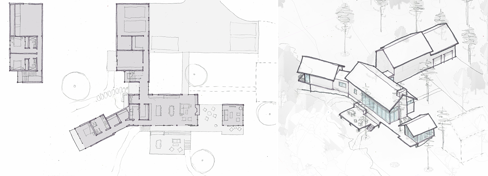
Design Scheme 2
Refining the Design Concept
After discussing the merits of both ideas with our clients, they unanimously wanted to pursue the more intriguing Y-shaped scheme. (This was our favorite, too!)
Feedback included two things: 1) wanting to increase the curb appeal from the street (not wanting to see the corner of the garage upon first look from the street) and 2) wanting a more prime view of the lake from the exercise room.
To address the curb appeal, we decided to flip the layout so that the garage wing wasn’t front and center. With trace paper in hand, we quickly mirrored the layout, sketching it on the site to show how this could look. It quickly won everyone’s approval. By flipping the layout, now the driveway leads your eyes toward the front entry.
Another interesting side effect is that we can now angle the principal suite wing parallel to the property line. This would ensure direct views of the water that wouldn’t be affected by the neighboring property.
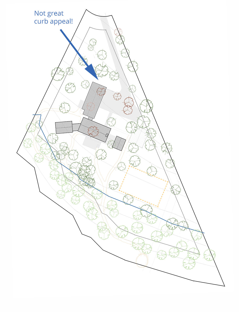
Prelim Design Concept Site Plan

Adjusted (Mirrored) Concept Site Plan
The other feedback (better views for the exercise area) required more creative thinking since it was currently located in the service wing. It would need to be in a different location entirely.
Our solution was to move the exercise room to a lower level, essentially a walk-out lower level. This gave the exercise room prime views of the water and access to an outdoor lower patio. We’d manipulate the grading to make this happen, but our clients liked the idea so we are running with it!
Here’s what the floor plan could look like:
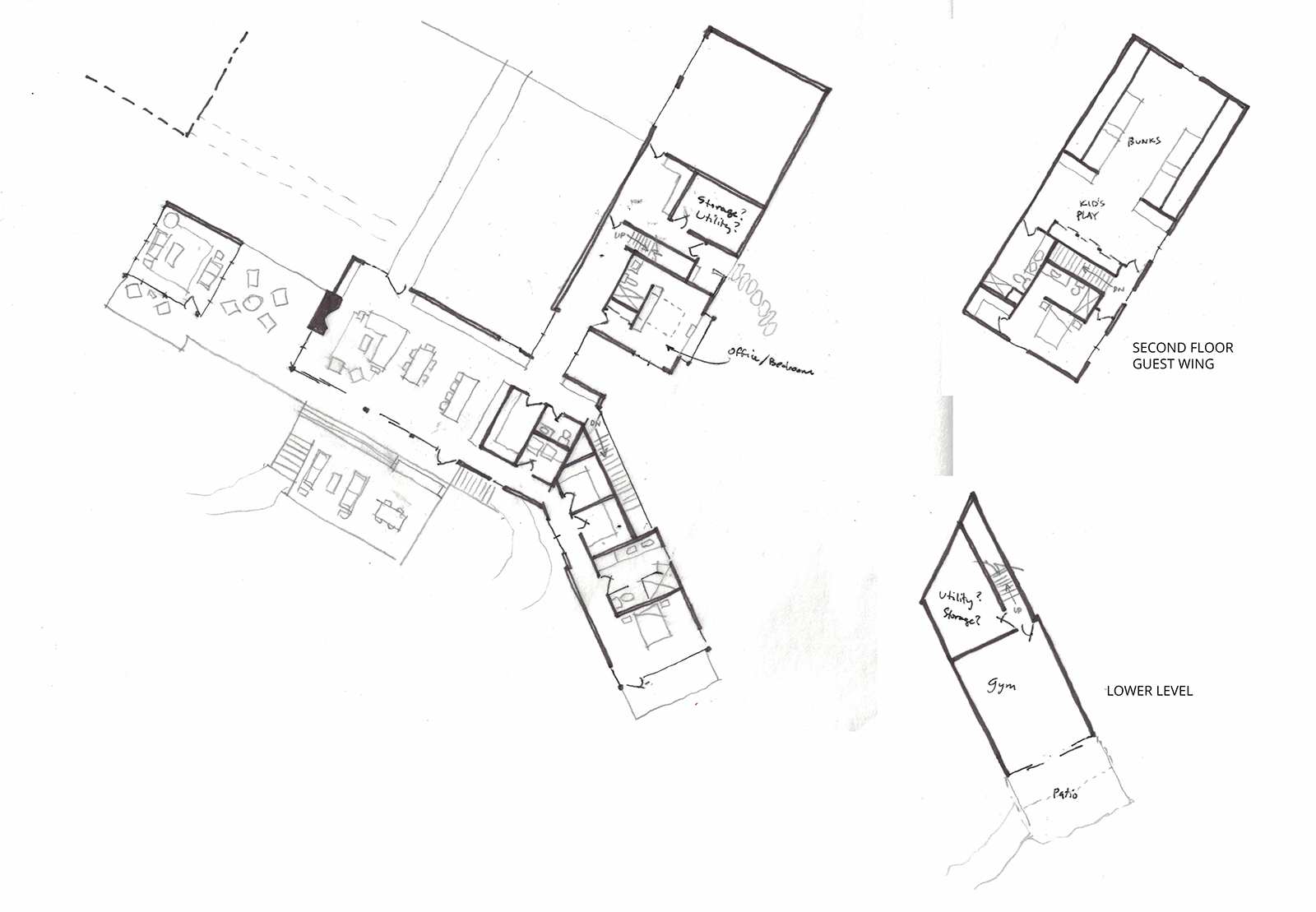
Revised concept floor plan
Final Concept Design
Our initial research into design precedents of modern lake houses on wooded lots gave us ideas and mostly reassured us that broken views to the water were still going to be great views for this contemporary lakeside retreat.
Still lingering questions to explore: What will the views be from each of the spaces? Since views are broken by trees, how will this feel? Do the decks and patios want to be contained? How will the earth meet the building? What is the cladding and roof profile?
All those answers and resolutions will come in time as we continue into the next phase of design development.
For now, here’s our design concept:
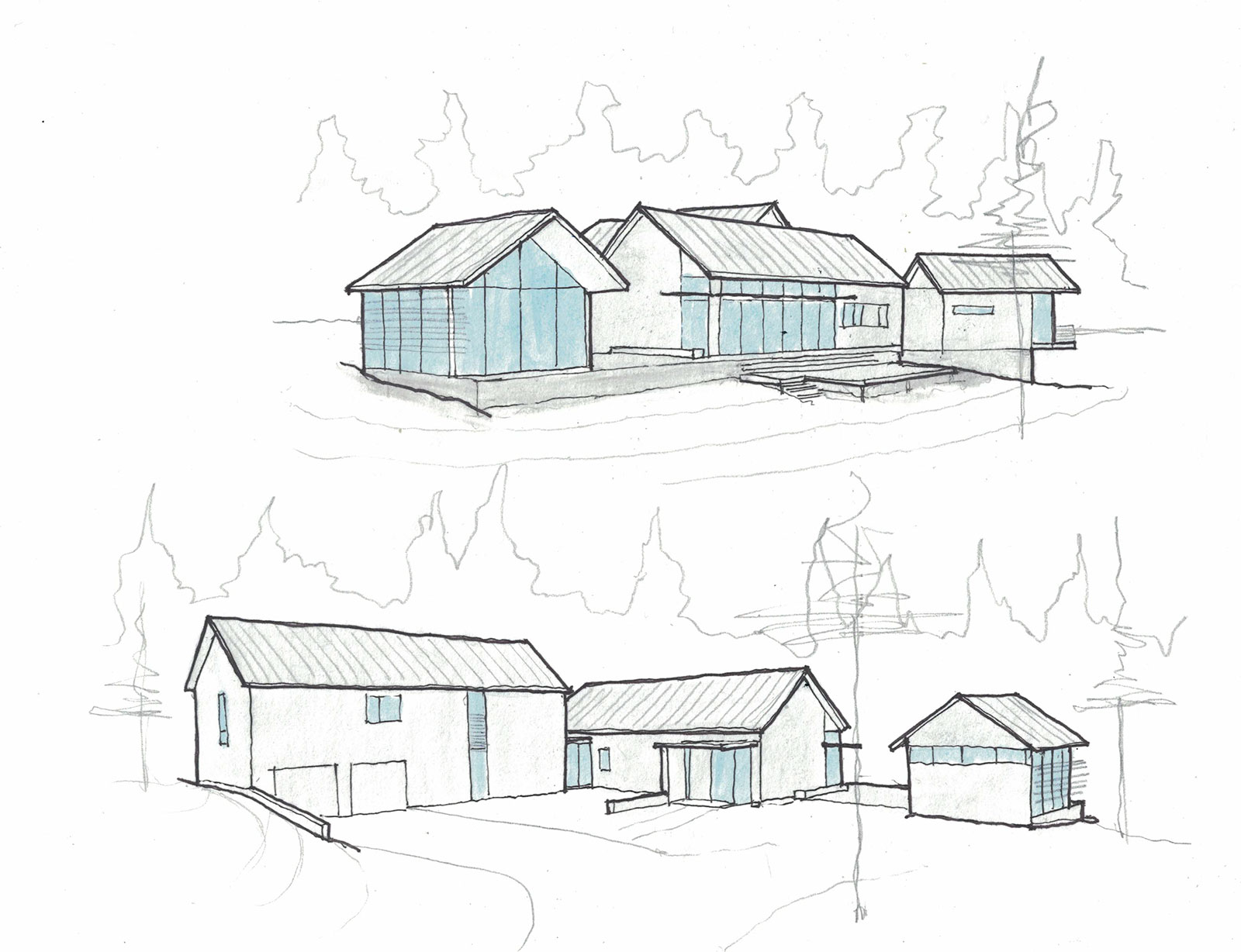
Conceptual Design
As for the rest of the design: Respecting the local vernacular of gable-roofed structures is important to us. We know we want a more contemporary design with clean lines, minimal fuss, and thoughtful detailing. We also want a lot of glass and a natural color/material palette to complement the landscape. We’re considering wood siding if the budget allows.
And speaking of budget, our next step is to get preliminary cost estimates to see where we stand now. Better to do it now before we get too far along in the design when changes are more difficult and costly.
We’re talking to contractors and hope to have some estimates soon. From there, we’ll evaluate the cost projections against our client’s budget and determine if should proceed as is, tweak the design a little to reduce costs or redesign entirely for more significant reductions.
Stay tuned for the update!
Planning a Contemporary Lakeside Home?
If you’d like help creating a thoughtful, site-specific modern home on your amazing waterfront property, we’d love to learn more about you and your project. Reach out and tell us about your project. We’d love to collaborate with you in creating something truly special for you and your family!


